Basic Statistics - Part 2
Bidimensional Analysis
Previously we talked about understanding the distribution of a single variable, i.e., to summarise the data set. Frequently we are interested in understanding how two or more variables behave together.
When interested in two variables, we can have three scenarios:
- Both variables are qualitative
- Data is summarised as a contingency table
- Both variables are quantitative
- Analysis based on scatterplots and correlation
- One variable is qualitative, and the other one is quantitative
- Analysis can be based on boxplots
Ultimately, our aim is to find possible relationships and associations between any two variables using charts or metrics in every situation.
We can think about association as a ‘change in opinion’ about the behaviour of a variable in the presence (or not) of another variable.
For example, ‘Is there an association between height and sex in a particular community?’
To answer that, we can think about the following:
For an arbitrary height threshold of say, 170cm
- What is the expected frequency of males above the height threshold?
- What is the expected frequency of females above the same height threshold?
If the answer to both questions is:
- approximately the same, there is no association between height and sex.
- if the answers differ, there is likely an association between those two variables, and we need to incorporate this fact to better understand them.
Association between quantitative variables
To understand the association between two quantitative variables, we can use scatterplots. For example, the following data set shows us the years in service and the number of clients of different insurance agents.
insurance <- data.frame(agency = c(LETTERS[1:6]),
                        years_in_service = c(2, 4, 5, 10, 12, 15),
                        clients = c(40, 52, 60, 70, 71, 88))

insurance %>%
knitr::kable()| agency | years_in_service | clients |
|---|---|---|
| A | 2 | 40 |
| B | 4 | 52 |
| C | 5 | 60 |
| D | 10 | 70 |
| E | 12 | 71 |
| F | 15 | 88 |
We can create a scatterplot to better understand the relationship of the variables. As suspected, the more years in service and agency has, the more clients it has, so the chart shows us a positive association between both variables.
insurance %>%
  ggplot(aes(x = years_in_service, y = clients)) +
  geom_point()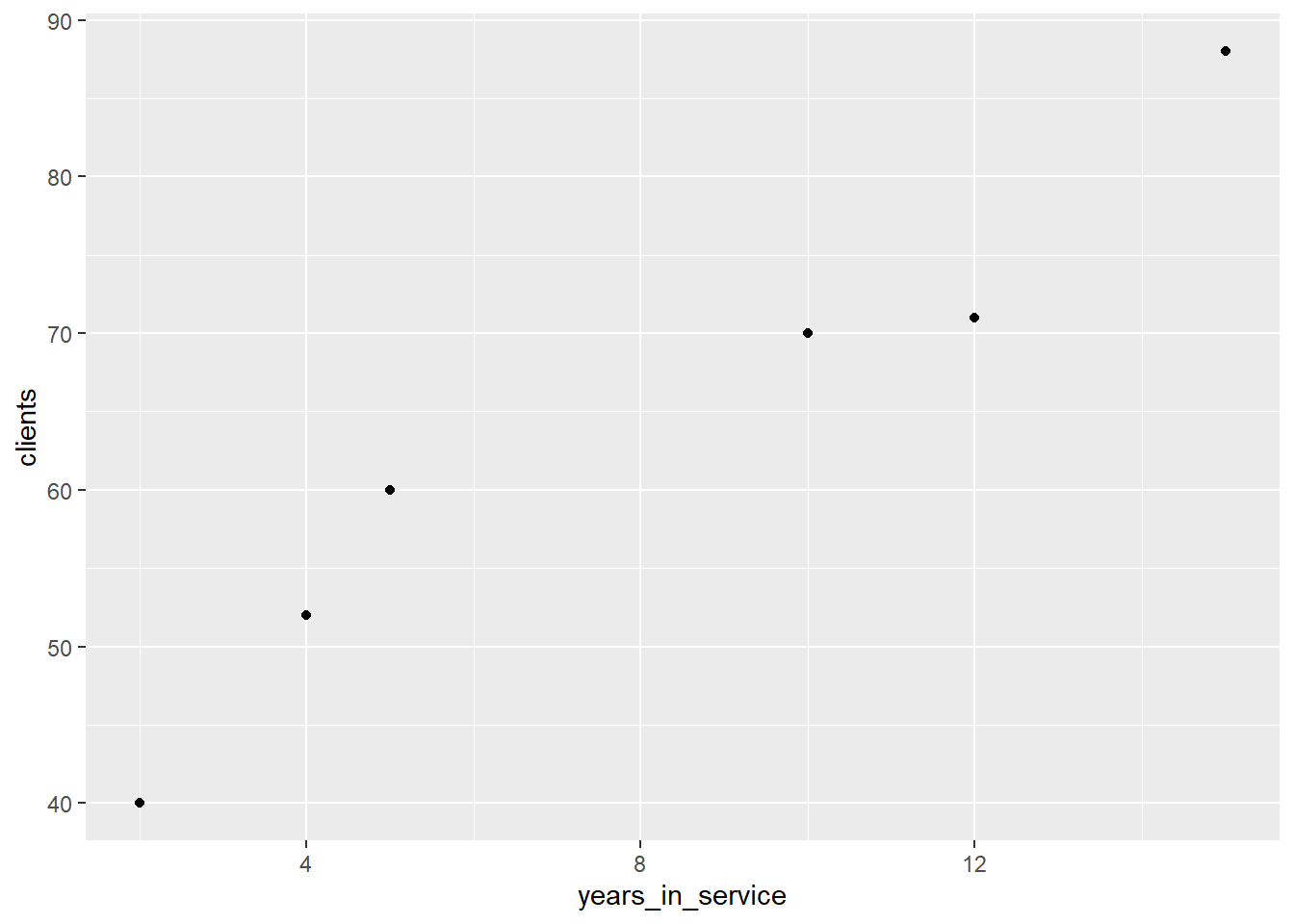
We can have 3 types of association between two variables:
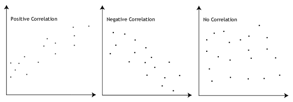
- Positive association
- Negative association
- No association
We can numerically measure the association between two variables by calculating their correlation. One of the most common ways of calculating it is by using Pearson Correlation:
\[corr(X, Y) = \frac{\sum{x_iy_i - n\bar{x}\bar{y}}}{\sqrt{(\sum{x_i^2 - n\bar{x}^2})(\sum{y_i^2 - n\bar{y}^2})}},\]
where \(-1 \leq corr(X, Y) \leq 1\).
The closer to -1, the stronger is the negative correlation between two variables; the closer to 1, the stronger is the positive correlation; and if corr = 0, then there is no correlation between the variables.
In R we can calculate the Pearson correlation using the function cor. As the correlation is approximately 0 we can say that x and y are not correlated.
set.seed(88) # set see to always have the same result - reproductibility
x <- runif(1:10) # generate 10 random numbers
y <- runif(1:10) # generate 10 random numbers

cor(x, y)
## [1] 0.02902127You can also try to calculate the correlation without using the native function. And we can see that the result is the same either by using the native function or the one created.
correlation <- function(x, y){
  nx <- length(x)
  ny <- length(y)

  if(nx != ny){
    return(print("Vectors should have the same length"))
  }

  top_part <- sum(x * y) - (nx * mean(x) * mean(y))
  bottom_part <- (sum(x^2) - (nx * mean(x)^2)) * ((sum(y^2) - (nx * mean(y)^2)))

  return(top_part / sqrt(bottom_part))
}

correlation(x, y)
## [1] 0.02902127Emmanuelle R. Nunes
Senior Data Scientist
My interests include statistics, machine learning, health and social statistics.