Basic Statistics - Part 1

Statistical Analysis
So, you are starting your journey into the statistical world, maybe because you are interested in analysing data, perhaps because you are working with datasets already and find yourself needing to draw meaningful conclusions from them, or perhaps you just want to know more about statistics. At some point when working with data, you will want to analyse and understand your dataset to transform it into information to compare, predict, or test a theory.

Statistical inference is a lot like a detective work. In a very general way, we can say that science is interested in making inferences about something, and this inference can be:
Deductive: From a premise to a conclusion
Inductive: Specific to general
Statistical Inference is to collect, reduce, analyse and model data, usually a sample, to make inferences about the entire population of interest.
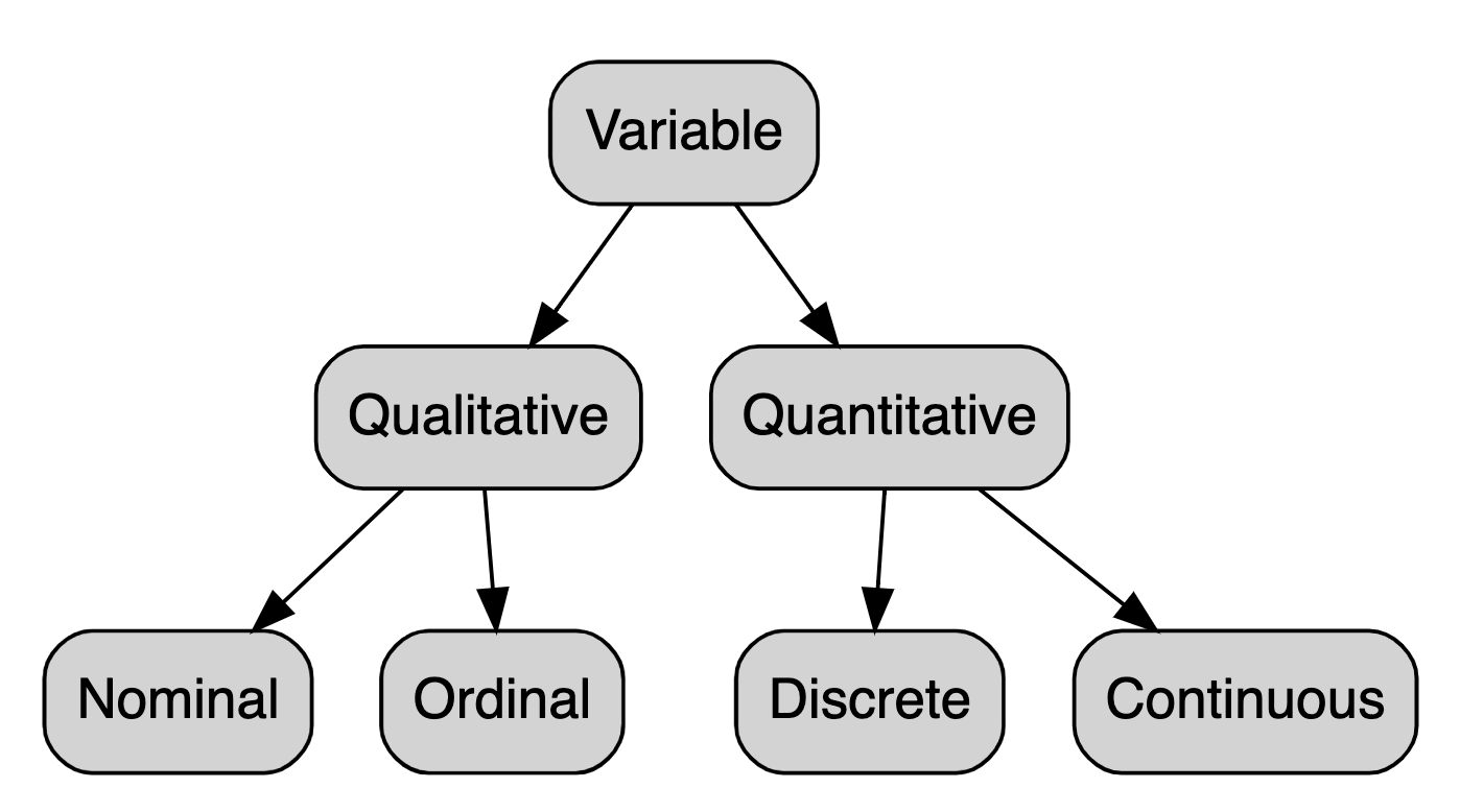
Types of Variables
When thinking about variables, we have a few important types that we need to be able to differentiate:
Qualitative variables: Variables that are not measurement variables. They can be classified as:
- Nominal or categorical: When there is no implicit order.
- Example: Gender, Race, Colour
- Ordinal: When there is an implied order.
- Example: Socioeconomic status, instruction level
- Nominal or categorical: When there is no implicit order.
Quantitative variables: Variables whose values result from counting or measuring something. They can also be classified into 2 categories:
- Discrete: The possible values are a part of a finite or numerable set, frequently resulting in a count.
- Example: number of children
- Continuous: The possible values belong to a real number set and are the result of a measurement.
- Example: height, weight
- Discrete: The possible values are a part of a finite or numerable set, frequently resulting in a count.
Graphics
Whenever studying a variable, our most significant interest is to understand the behaviour of this variable. The best way of understanding the distribution of a variable is by using charts.
Charts for Qualitative Variables
There are many ways of representing qualitative charts, one of the most famous is the barchart. Using ggplot2 we can create a barchart in R.
library(ggplot2)    # charts
library(dplyr)      # data manipulation

data.frame(colour = c('red', 'blue', 'green'),
           frequency = c(10, 50, 88)) %>%
  ggplot(aes(x = colour, y = frequency)) +
  geom_col()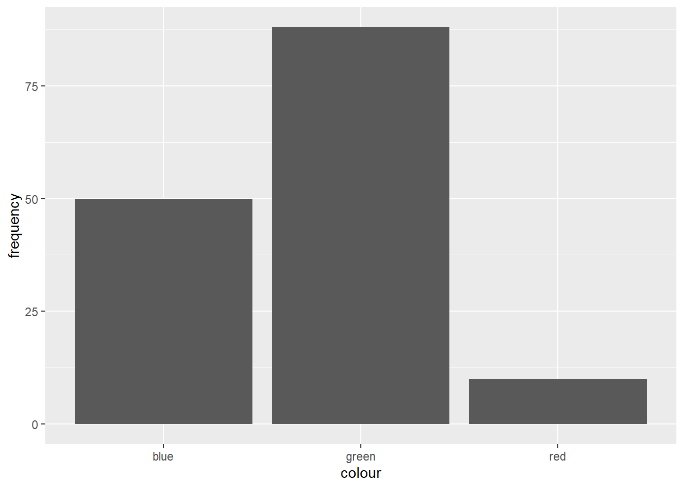
Charts for Quantitative Variables
One of the most famous ways to represent this kind of data is by using boxplots.
# generate 50 random number from 40 to 100
data.frame(weight = runif(n = 50, min = 40, max = 100)) %>%
  ggplot(aes(y = weight)) +
  geom_boxplot()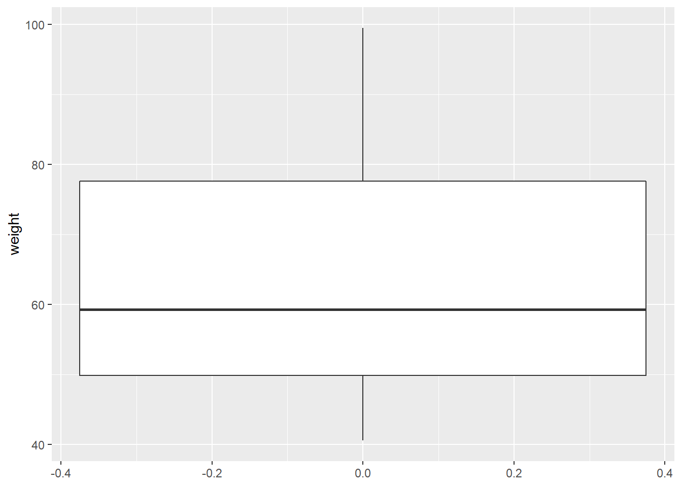
Descriptive Statistics
Descriptive statistics gives you a general idea of trends in your data including:
Mean: Average of a data set.
- It can be written as:
\[\bar{X} = \frac{x_1 + ... + x_n}{n} = \frac{1}{n}\sum_{i=1}^{n}{x_i}\]
Median: Middle of the set of numbers.
- It can be defined as:
\[ Md(x)= \begin{cases} x_{\frac{n+1}{2}},& \text{if n is odd}\\ x_{\frac{n}{2}} + x_{(\frac{n}{2}+1)}, & \text{if n is even} \end{cases} \]
- Mode: Most common number in a set.
Spread Measures
To summarise all the information of a variable into only one central measure hides all the information about the spread and variability of that particular variable.
For example, let’s assume that we have the test scores of five students:
data.frame(student = c(LETTERS[1:5]),
           test1 = c(3, 1, 5, 3, 3),
           test2 = c(4, 3, 5, 5, 5),
           test3 = c(5, 5, 5, 5, 5),
           test4 = c(6, 7, 5, 7, 6),
           test5 = c(7, 9, 5, NA, 6)) %>%
knitr::kable()| student | test1 | test2 | test3 | test4 | test5 |
|---|---|---|---|---|---|
| A | 3 | 4 | 5 | 6 | 7 |
| B | 1 | 3 | 5 | 7 | 9 |
| C | 5 | 5 | 5 | 5 | 5 |
| D | 3 | 5 | 5 | 7 | NA |
| E | 3 | 5 | 5 | 6 | 6 |
If we calculate the mean test score per student, we have: \[\bar{A}=\bar{B}=\bar{C}=\bar{D}=\bar{E}=5\]
All students have a mean test score of 5. Still, the variability of each student score is hidden if we use only a single metric to represent a variable, so we lose vital information about it.
We can measure the dispersion of variables by calculating the following:
Variance:
\[Var(X) = \frac{\sum_{i=1}^n{(x_i-\bar{x})^2}}{n}\]
Standard Deviation: Root square of the variance
\[std(X) = \sqrt{Var(X)}\]
Range: Difference between lowest and highest values.
Quantiles
- The 0.5 quantile represents the median (q(0.5))
Simmetry
We can use quantiles to understand if our distribution is symmetric. If your observations are symmetric, then \(Md(X) = \bar{X} = Mode(X)\).

A distribution is positively skewed or right-skewed if the quantiles on the right are farther from the median than those on the left. If the contrary happens, then the distribution is negatively skewed or left-skewed.
Emmanuelle R. Nunes
Senior Data Scientist
My interests include statistics, machine learning, health and social statistics.